Web Designing facts which will blow your mind
Competition in web designing is increasing with the passage of time as we are getting modern. A fully functional website is the basic need of every business in the digital world and anybody who fails to give that cannot stay for longer in the market. Website designs are one of the ways to interact with your client which is quite difficult to design but easy to capture a large number of customers for your company.
You should update a website design every 3 years
Technologies are becoming new every passing day. Tools and techniques are changing and the way of using a computer is changing completely. For the survival of a business website, you have to update it in every 3 years. This will give a dynamic user experience and save the website for becoming obsolete. A user perception can get changed with the design of your website and this will never cost you too much.
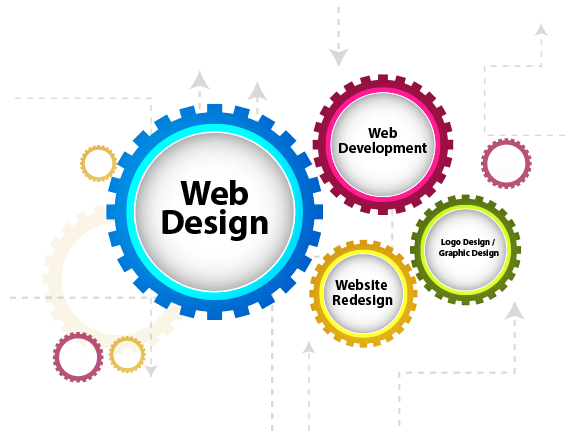
Browser-functional web design
A web designer has to look same on each and every browser which increase the effort for the designers but at the same time, it can give the relaxation to a lot of customers. HTML and CSS are the standard languages which can help you through the journey and make you fully functional on each browser no matter you are using laptop or mobile you will get the best user experience. A study tells that only fewer changes can make a website functional for all the browsers. Diverse browsing can come with several problems so never try that web design which can give you bad results in future.
Web Design also tells the user focus
Website design can decide user focus which also includes the incorporated content. Content should be integrated on the web design in a way that it gets prominent and get the attention of the user. If the web design fails to get the user attention in first 10 seconds you can lose the loyal customers and increase in the bounce rate can give you high risk. Web designers have to be very beautiful and have full information so that a visitor on the website can turn to your customer and make a purchase immediately.
Beat all with responsive web design
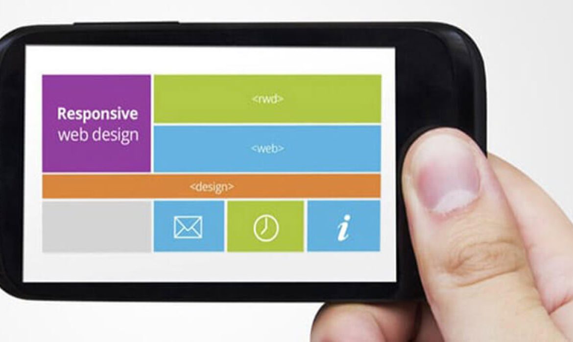
Web design responsiveness is one of the vital factors in making a business profitable. A website has to be accessible on every device is called responsiveness of the website. The design of the website has to be flexible that it can easily adjust its content with the size of the device. You can also say that through this a website can get smart. A website which is not responsive can never get the business. A website which never crashes or hangs on any device is the best one and that have the ability to get famous easily in the market.
Code of the website can increase the Search Engine Ranking
Visibility on the internet is all a website need and for that business, persons work a lot. If you have a good website design which is not coded properly you can lose the views from the audience which is disappointing. Coding is also one of the vital parts which can help you to enhance the presence of the internet. If your website is not good at coding that can also create the problem for you.
Costing Factors in web design
Web designing fame has taken it to the new level worldwide. Now the development and designing are becoming one of the top industries which are applying different strategies that will attract the customers and they come to see the website. With the passage of time need of designers and developers is also increased and they are costing much from the clients. We will tell you about the certain factors which have increased the cost of the web design. We are breaking down the projects of the web here so that you will understand why they are of the high price.

Web designing
Most of the companies are demanding for the design which is coming from scratch now. This should be custom created so that this can increase the branding of the company. That was the old time when ready made web designs were famous in the market. The cost of newly made web design is higher than using a template web design. Companies are striving to have an eye-catching website for their audience so that they can earn a lot. But that needs money investment too. Increased use of smartphones has also made the website designing crucial.
Content on the website
Pages of the website also affect the costing so you must know that how much pages you want for your website. Your functionalities on the web pages can determine the cost of the website and that is not an easy job. The more research that companies will do to design the website will also become one of the factors for the increase in cost. This makes a list that how designer gone through different pages to make your website. So never try to complicate the things and stay calm while giving your requirements.
Content on the website
If you are planning for the content which is already made for the new web design this will cost you less but if you have the new website and don’t have any content you have to pay for that also. Web designing with the best content is most of the time expensive and you have to pay for them if you don’t want old content. The web content has to be very flexible that it can fit the need of every screen that will increase the audience. You can increase the interactions on the website also which will affect in the costing.
Navigation and Usability
Website design effort is a lot and designers are making things well. They have to keep their focus on the navigation and that is also cost something. The formulation of smaller labels and links to a website is for sure not an easy procedure and it needs a lot of formal testing before delivering it to the customer. The more element you add on the website the more expensive it will cost you. This also decreases the bounce rate of the website and you will get more audience but the cost will be high for these websites.
Size of the website
Website size matters a lot in the cost and you can consider it as one of the main factors. The large website also needs a lot of research and for sure need a lot of testing. This increase in the designing time of the website for the larger organizations.
Website Redesign Plan for success
Most of the companies never think about redesigning a website because it takes too much effort and time to make a website design again and it can be risky. The impression of applying the modern technology and design drifts is appealing. But as a rule, it is better to have a conventional and outdated website which is functional than a shiny modern design that is not paying off. Before making a redesigning procedure it is necessary to clearly define the goal behind it.
Why need to redesign a website?
Most of the users think that a website should redesign for a change in the look, but this is not the scenario. There are some reasons for which a website have to redesign and we will discuss those factors also.
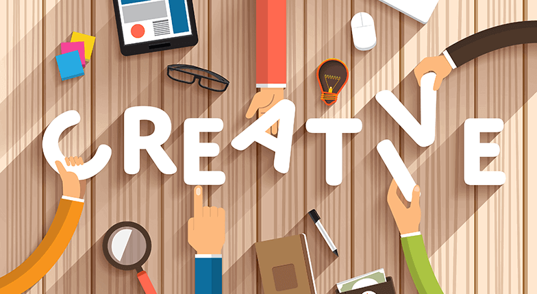
More sales and improved usability
Your website can lose the potential customers also when you are not using a new web design because users want to see good on the website which becomes older with the passage of time. You should redesign a website in this scenario.
Business changes structurally
Your business model is now changed and now your website is not anymore reflecting what you are doing. For example, you were not selling flowers on the website in past but now you have the option of delivery. You need to upgrade the website this will increase your audience and you will get more customers through this.
Branding
Most of the users leave the brand because of their website. They get the annoying experience on their website. This is the quite good reason for leaving a brand but to retain the audience you must redesign the website. Fix the bad user experience will increase the fame of your brand in the market.
Matching user concentration to business goals
A website has to be user-concentric always, on the other hand, it has to meet the business goals. If this is not happening then there is no point to make a website. You can see that what the audience are searching for if you want to target the new group you have to make the new persona to see what they need. User intent is one of the vital things that is required at every stage to make the user happy and they will buy the products with ease. When you are going to redesign a website always ask these question from yourself.
What does user want on this stage?
What you want that user do on each stage?
This will increase your purchase if you are selling something online. Try to craft the UX and content of the website carefully because this is more expensive when you revise one design again and again. Also, try to give more functionality to the new web design because a good web design does not guarantee that you have won the game.
The content side of the website
Website content is one of the powerful tools which can increase the sales. You have to pay a lot of attention to the content if you are going for a redesign. There are some facts for it
Content and visual design of the website goes hands in hands.
Website content can be capable to sell the items on the website.
If you don’t have an exact content you, it becomes more difficult to design a website. At the same time
Top trends of in web designing that will rock 2018
The Internet is one of the important ways of work on which most of the sectors are now depending. The Internet is one of the vital sources through which a lot of people gain information. This also has increased the need for web designing and developing. Most of the companies hire developers and designers to add the content on the website that is helpful for others. This all also increase the visibility of the website. The user can see the added information from all around the world. On the other hand, this is a key responsibility of developers and designers to update the website by following the latest trends and fashion. One of the facts of the website is an online representation and that is called web design which can attract a lot of users and one design is always used for one website as this is one of the identities of the business.
Animations and creativity
More animations mean more creativity and the world is really looking for it on the internet. Animations are for both purposes such as work or entertainment. This makes the website even more convincing and always force the user to see more parts of the website. 2018 is the year of creativity and for developers, it’s about neat the coding. Introduction of more prototyping tools is now one of the biggest innovation which is observed in this year.

Attractive Colors
2018 has grown its branches and this year you can step out of the box. You can now do some experiments and take the new risk on the web is one of the biggest things. New things are coming up with the vast variety of colors with some dominant and catching for eyes web designs. You can use colors on the web in many colors and ways. This will increase the visibility of the website. Most of the designers are trying new trends which will increase the website fame and we can guarantee you that.
Typography
Making an eye-catching website is a battle and one of the weapon which is most powerful that is called typography. Typography needs special focus as this is one of the important things on the website. The content of the website is one of the key reason for which users access our website. But our all effort go waste if the content of the website is not much attractive. So, always try to bring innovation in the typography. Typography with high resolution is one of the main things in the web design. This increase your customer retention and you can easily grab more audience from it. 2018 will be one of the years which will give important to the content of the websites also. Bold fonts will catch the audience attention.
Communication ways and trends
Advancement in technology is one of the important factors and also the usage of technology in the designing of the website is getting famous. In the modern world, AR and VR devices are introduced. This all has made the web designing more crucial. Now you have to make the website in the more creative way in order to cater to the needs of the client. New websites have to be designed in a way that it covers the perspective of four dimensions world through technology and the internet.
Why do you need web hosting
You must understand the power of web hosting if you want a website for your business. If you want that your business grows well then you must decide on the web hosting company smartly because if you don’t have a solid host there is no way around to save yourself. We will help you to understand about web hosting today and also tell you why you need web hosting.
What is web hosting?
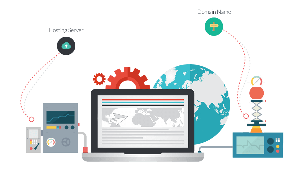
You can say that web hosting is a home where you easily store the things you have. Except for household and furniture you have to store the website that function. These files are most of the time of HTML and CSS, documents, media, and other. Web hosting company plays the role of the owner of the home who will take rent of the home. It is easy to host a website so that it becomes visible to all over the world. In order to get online on the website you also need a domain registration name.
Why need a Web Hosting ?
If you want a website that you can own, you need to invest some money in hosting. You are lucky that it never cost higher to have your own space on the internet through which you can earn on the internet.
Control you have
If you are using the blog website and your host is somewhere else you can be at higher risk. You have to be online and agree on the terms and conditions of the blog which is almost very difficult and take a lot of effort. If you make your own website the risk becomes lower and you will never need to obey someone. This is one kind of independence for you and if you want further updates on the website after annoying some of the customers you will get back.
Customization option
Hosting platforms and brands are the old companions to each other. We can say that your website shares branding with the host. This will surely lose the credibility of your brand with customers and overall look of the website will be not that much good. So never try to use a free host option for you as there is nothing but a failure waiting for you. If you want a proper host with all the necessary plug-ins for your website you can ask from a good hosting company which will provide you with the tools to grow the audience. When you are the host of the website you are in control and you can see what fits our website and work accordingly. So never bound your creativity.
Safe website
Hosting website is also saving your from any harm on the internet because they are always providing you with full proof security. You just need to choose some security plug-ins and CMS. We can guarantee your security online when you have a good web hosting company because they never want your loss. Many companies like web designing are offering 24/7 professional services you have someone you can easily contact easily and fast so this is now not an issue to make a website on hosting to increase the beauty and online visibility with data security.
Your Guide to Navigate Hot trends and Avoid Fads
In the digital era, small businesses are competing in the noisy world. They are most of the time against large brands or dominant businesses. Customers who are somehow interested in your brand need something to remember about you. Logo of your company can serve you easily in this regard. The new customer coming on your brand needs a symbol from that they will know about you and remember you. All the logos are not created the same way and we will tell you about the latest trends in logo design which appear every year.
Imaginative Typography
Along with the visual shape, typography is one of the vital parts of the logo. Some logos are only made of text. These are called word marks or better marks. You cannot use some common texts like time new roman, or comic sans and call it successfully made the logo. Your text makes your brand important. Typography always continues to grow as we head in the modern world. Here are some examples. You can use the split the typography or you can make it joining.

Bright colors
The Internet is continuously changing the way of interaction with the users. It’s really important that a business design their shape brands with the medium in the mind. Computer and smartphone can be one of the media of displaying colors which provide the perfect canvas to show bright things. This is what we think that the importance of the bright colors. Intense colors are now removed from the hues to the lighter one or you can shift them to the gradient. So, never afraid to play with different color options. This will never cost you much ever.
Geometric line art
Geometric shapes are the one which is out of favor from the architecture of the world of graphic designer and fashion. This is one of the trends that will be heading in the year 2018. These designs look elegant and simple and they are easy to fit in every size. However, a simple design is never the answer to all the problems. Logos are always different this increase visual identity of the brand. A logo has to properly increase the remarkable communication between you and your customer. If you are using geometric lines logo make sure your choice supports and reflect your brand identity.
Social media optimized Logo
Social media logos are valuable in the market because these are the platforms which are making the audience for every brand. So we can say that social media logos are different from others and they are media friendly in the year 2018. Most of the social media platforms are offering square space on the social media as the profile picture. So you should make a logo that exactly fit in the square.
Simple Letter play
Single letter and monogram are one of the famous trends. In the year 2018, there is a lot of fame continue to the persistent. Unfortunately, monogram and letter logos can be incredibly hard to make unique. Business owners love to make logos in the business initials. If your customer will associate those initials of your brand this makes sense. One letter logos are treated as the lazy logos which never show much creativity of the designer and they don’t need to think much. There are a lot of sequences of letters which is not mentioned. All the logos with the same sequences looks the same.
Top Graphic Design Trends for 2018
Old trends become new with the passage of time and this year will be a year of modern graphic designs which make the design flat. Unfussiness and simplification will stick around, some favorites will be expected to see the limelight of modern updates in the design. You will see some of the best graphic designs in the coming year which will increase your customers. Here are some of the latest trends of 2018.
Responsive Logo Design
Responsive logo design is becoming one of the famous trends which are revolving over the last 10 years. Increase in the smartphone users have made the usability critical one and the web trends are also increasing. Designers and developers are trying to make a design which can adapt every screen easily this is could be one solution. This is one of the groundwork which we called responsive design. User demands are changing the ideas of logo designing and those ideas are unthinkable till now.
Color transitions (gradient)
This is one of the top trends from past which is still applicable. Gradients were found on every button of the website. Gradient gives grace to the design. In 2007 this trend becomes sidelined as that was the era of flat designs. Flat designs are now evolving and gradient becomes the modern day comeback as an enhancement of the flat design. This enhancement can be called the semi-flat design. The reappearance of iOS and Instagram strips has solidified the fame once again. Now the designs are the form of branding, backgrounds, illustrations, and vibrant UI overlays. Now the color transition term has made the reference with gradient and it looks really attractive to the clients also.
Deeper
This is also one of the latest trends in the market. Shadows are officially back in 2018. This also became one of the older trends like gradient but now this is increasing in the market. This is also making the design semi flat which is again as the gradient. Depth is one of the valuable tools which is helping out the users which will make the visual hierarchy in input and calls to action fields on the screen. Logo dsigners are experimenting in the long shadows. This means you are adding dimension to the flat designs when you are making the Google material designs.
Boundaries duotones
Duotones are conventionally made through the halftone printing process where one halftone is on top and another contrasting color will be imaged as two-tone. This has made a new change in the digital media. The software has made the things easier which will make the duotones which can be related to the monotones, quadtones, tritons, and other fake duotones which are also known as tinted colors. Most of the biggest brands are using this way for their products which look much attractive.
Patterns and palettes from 80’s and 90’s
From electronic hues to the beautiful pastels all the color schemes from 80’s and 90’s are getting famous. On the other hand, geometric patterns are inspiring the era which is now becoming the reason to attract the more targeted audience. This is also called the visual excitement.
Gifs trend
Animation trend is increasing to make the stuff on the website which is increasing the understanding of the audience. This is also adding style on the website which you never think of. Most of the websites are taking the attention of the audience.
Importance of Having Mobile friendly website
The digital world has transferred our desktop computers on our fingers. We are now using smartphones for each purpose because this is an easy way to access the internet and buy things online. Advance technology has glued our smartphones in our hands. No matter what is the situation we are always available on internet and life is not good without having a cell phone. Either you are the peon of the office or the CEO of organization you are using the mobile phone like an addicted person. In this situation a website has to be mobile-friendly which is one of the crucial tasks but if you successfully make that you can engage a larger share of the market. Mobile-friendliness of the website matters a lot if you want to get succeeded in the business.
Power tool
If your website has the ability to attract users. Smartphones are one of the power tools and can make you connected so you can attract a lot of audiences. This will increase your revenue and you will impact positively on the business. If your website is not mobile friendly you will never impact well on the business . .
Compliance with the website
This is one of the magic that how a change on the website can change your customer immediate impression. A design bends according to the device used to contact it make it constructive among the users. It will surely show that how you are focusing on the business. Many web designing companies are offering good web designs to the customers in order to attract the audience.
Impression on user
Usually, a user can stay on the website for 5 seconds and if the website is not good they will never come on it again. So, make a website responsive and easy to navigate if you want to retain the audience for the larger period of time. This will also increase the fame of the website and your product and services get sold easily.
Search Rankings
If you want to get favor on the search rankings we are here to provide you with best. If your website will be responsive one you will easily become famous on the search engines also. If your website is not mobile friendly search engine will automatically push down your website. So now this is the demand of search engine and customer to make a website friendly for mobiles. Your website has to look more appealing in order to get more customers and to get better positions.
The text of the mobile website
A website has to tell its purpose to the users if you want to grow in the market with the positive impression. The mobile text has to be readable for the users so that they can easily click on the website. It should never be too small to read. Before you land on the page of the website it should clarify the purpose. The average rate of browse website by the user is around 2500 on the internet. Make your website something which makes you stand out and it will directly influence the sales of your services or products from that website.
Business enhancement
Make sure that your website comes up with the unique content because this is one of the key factors that will enhance your business. Mobile friendly websites increase the visibility to the users with the increase in sales also.
Logo Designs Doesn’t have to be hard. Read these 5 tips
If you are planning to start a new business, you’re in need of a logo. Logo designing is one of the exciting journeys. We see many logos all around the world which are grabbing the attention of the audience. The logo is always passing a positive message for the community and also telling the details of the brand. We are here to tell you some of the tips through which your logo will look professional. You can apply them to enhance the logo of your company or to make a new one.
Less is sufficient
Use of simple things in shapes and colors can make it easy to attract the attention of the audience. If you want to get famous in the audience always try to use negative space in the right position. Your logo has to be flexible when you are combining it for printing purpose it equally looks beautiful as on the screen. This is one of the tricky parts but you can make this part easily without any difficulty if you think the things smart. If your logo is simple you will win the race of its fame easily.

Psychology of Color
Elements of the logo look more beautiful when you pick the colors carefully. Colors bring graduation to the message which you want to spread in the market. Most of the bigger brands are now using this way in their logo which is loved by the audience. Bright colors can take the attention of the audience which will increase the fame of your company in the market. Most of the people are very concerned about this and we can understand this thing that is the reason for giving. Muted colors add sophistication in the logo design but they never grab too much audience.
Typography
Most of the time when typography got the fame that is in the symbol style. This is very complicated to design but make an iconic symbol. This can add with the logo and they make a perfect combo together. But the font and icon if not match with each other can make a disaster for which you are not ready. This will divert the attention of the audience and they will never understand the message properly. So, try to make things in the perfect balance. This is one of the keys to success for you.
Avoid Clichés
When you are making the logo always try to avoid the most obvious things. Clichés are one of the image in a logo that was famous at a point, which is overused and lost the ability to attract the audience. Obvious designs behave like the junk food which is available at anywhere easily but never impact for a long time in the mind of the customers. This means your brand will lose its identity easily and this is not good for a business. So don’t try them ever.
Target Clients
You have to keep in mind the larger group who can be interested in your services and products. You can design the logo in accordance to them so that you can easily take the attention of that audience. Always refer back to the design this will show that you are sticking to the brief design. Always keep in mind about the demographic information which also includes age, gender, background, marital status, and other factors.
Top 10 Modern Logo Design Trends
When we talk about the branding businesses, Most of the people think about the designing of logo designing. The logo makes the separate identity of every brand which attracts the users and makes them loyal to one brand. The logo is one of the things through which a business recognized in the market. This is for removing the confusion from the customer’s mind. Most of the businesses think that a logo is one of the valuable assets of the company which makes the look of the brand and attract the audience for them. This is also telling customers that what brand do. This is one of the sufficient reason why companies pay a lot of amount to the designers who can make the good and unique logo designs. .You should not put the pressure on the designer for a good logo design because they don’t need any limitations while designing a logo for your company that can easily attract a lot of audiences. We will tell you about some of the latest trends.
Simple Logo Design
This is one of the famous trends in all of the brands which is increasing the interest of the audience too. Most of the businesses are using this way of the logo. Most of the people are loving the cleanliness of the logo. Most of the logo were got the fame in the past because of the simplicity. Most of them are the old businesses according to the statistics. Many businesses never get the business due to their unclean and dirty logo designs. This is never an easy job for a designer to make a good logo design.
Breaking Letters trend
One of the main trends that are making the market fallen in love with it is the breaking letters which make the logo beautiful, simple and add class to the logo. Some of the people think that this is an easy job to make a logo like this but the modern time has made it more complicated design to follow. Combination of different fonts and other different thing make this logo more beautiful and attractive to look at. A lot of creativity is also involved in making these types of logo designs.
Drawing Logos
One of the famous trends in logo designs is the hand-drawn logo which is in the market from the year 2016 and still, the craze goes on. These logos are increasing the credibility and charisma which is needed to grab the customers towards business. The logo design needs a lot of effort and skills from the designers but you can see the results which make the logo attractive and unique. Not all designer has the ability to make the hand-drawn logo correct. But you will find a designer in web designing company as they are best.
Color code simplicity
Conventional logo designers always admire the mixture of colors in logo designing because the color that combines clever can make a beautiful logo design. But as we are in the modern world most of the designer think that color scheme should be simpler so that customer can consider this logo. Colors always distract the audience this is one of the biggest assumptions. So, always try to use a logo which is giving a prominent message and look catchy is more than enough for everyone. On the other hand, you can add some effects which make the color more attractive.

