How User Personas Can Improve your SEO Performance
We have made a lot of new changes in the search marketing and this is the really long way in the accurate direction. Gone are the days when companies make a lot of pages which were targeting to keywords to rank on the Search Engines. We got a lot of visibility which causes high bounce rates rather than the productivity. Persona-Driven SEO strategy is the new trend for the last few years. Now the companies are making sufficient websites which can satisfy the needs of the target market. This is the process on which we can apply best practices of SEO. On the other hand, marketing of your favorite content on the website can be one of the improvements in this regard.
Get yourself personified
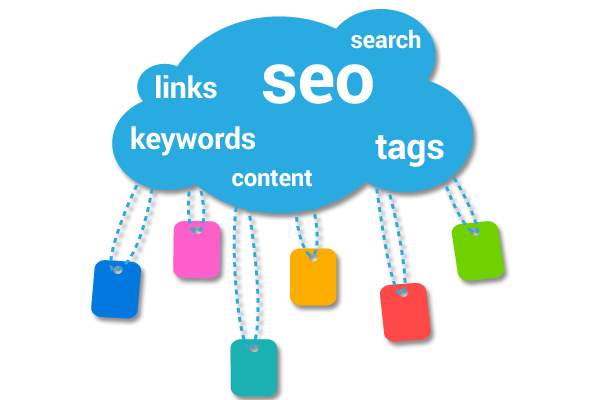
You can make your persona for doing SEO and digital marketing by using a combo of analytics data and internal team discussion. Don’t make the difficult procedure fast and try to take some time to complete the process.
Duties of Departments in persona-driven SEO
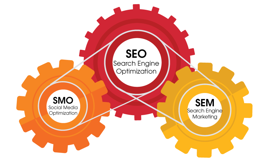
This is one of the time taking and working a lot strategy which also needs members from all the departments which need to take part in this activity. This is also used as a clear-up in our SEO process in order to focus on ranking for all the keywords but only for the vital one. Your organic visibility will never increase but you will get good space on profitable keywords that will help you in increasing the audience.
On Page SEO
You can make links and links to the internal content pages of your website in on-page SEO. This will ease the search crawler to go deeper in your website and you can make some important pages on which your search crawler can see you. Persona website visit can also increase your visit through different pages. You can also go to the chat method so that you can spend more time on the website to decrease the bounce rate and make your website stronger one. Try to make the contact in the content to make the links this will increase your website ranking in terms of proper content.
Navigation
Common ways on the website must be visible for every website this will ease the audience also. We have to consider those users who are coming on the page and bounce back to the homepage. This will indicate the confusion of the user which means you have to increase the navigation of the website. You have the chance to revamp for the main page navigation and also include some supporting navigation in the internal website. The more internal links to one page are telling the search engines that these pages are dearest and nearest to us. Try to make a navigation which is like the breadcrumb.
Content on the website
Content is popular when we walk on the website with the persona this can make you the market leader if used properly. Once you started using these pages you can also observe the search analytics of Google search. Now you can recognize which keywords are making a path for this traffic to the website. You can access the pages with that specific keyword without making your visit Spam. You can use some profitable links too. Always take care that your activity shouldn’t show you spam otherwise you will never win the game.
5 things you must know before the designing of your Logo
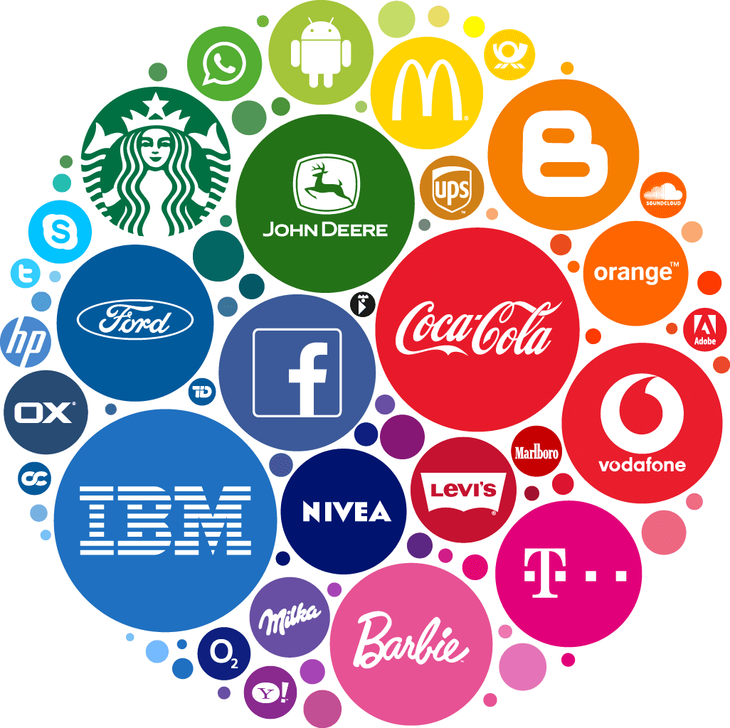
We have had a research in school in the Career day and there we started an activity for the company on kids of 5 to 12 years. We decided to start the game with the identifying logos. I was having the cards with famous logo and the kids were shouting the name of the logo like “Lego! Disney! Starbucks!” they shouted in the union, some of the cards were black and white specifically Nike and McDonald logos . Still, the kid gives the correct answer quickly this was one of the amazing experience. Even the logo with black colors was guessed quickly, they had just observed the check mark on the sneaker and M on the fries and know the brand easily. This is the one logo which every brand want for them.
Brand before your Logo Design
Most of the time customers are just exploring the market and your brand become the mind relaxer for them. This is the reason every brand is doing much effort to make the logo a beautiful one. This is presenting the true essence of the company. Many business persons think that a perfect logo can save them and they always make a brand around the logo. The logo has to better translate the name of the brand.
Try to assess styles which you like and don’t like
All the logos are not the same that is one of the main points which appears every year. Not all the logos can easily incorporate the latest trends effectively you have to avoid the fads and incorporate something trendy in the Logo . On the other hand retro design, negative space, and monoline design were all the variety. But this is always not very clear that what is a trend and what is a fad.
What you can pay for a logo
Logo designing prices are important but they vary from cheap to expensive. Some of the business owners pay less for the brand and ask a logo from a so-called Logo designing store which can easily put your business on risk in long-term. Already made logo can never reflect what your brand is doing and most of the companies are having the same logo as you. So, we can say that this can be one of the failures for you and if you are planning to do this you will waste the money.
Strong brief project
A project brief can decide about the fate of the fate of the project. We can’t stretch this much. Most of the designers have limited time to make the logo so they are very choosy about selecting a client. Always keep in mind that you know your company best and this is not mean that every designer will read the brief. So, always help the designer and tell them that how you see your company or your services.
Final brand decision
Some companies have a lot of interference in the feedback and picking the final logo design. But this can hassle the process which you have to keep smoother and simpler to get the success and to make the final decision on it. You just have 50 milliseconds to make a good impression on your audience and you have to play smartly in this.
9 things Logo designer Wish Clients Knew
Reaching out to a designer for web designing is one of the difficult tasks but that is difficult for them too. We have talked to the designers also who were specialist in branding they told us some of the things which they wish client knew. They responded to us with everything from common gripes to a good advice. This will make the process of designing smoother for them and for the employees also. We will give you some tips for that too.
Don’t start with I need a logo
According to them, a logo is not just part of branding but they are telling details about a system. You have the best logo but this is not telling the right purpose of the logo you will fail to deliver the message which means no sufficient business. This is the situation where you are paying for the logo and nothing. Trying to make a logo alone is not a good habit.
Homework of the clients is the must
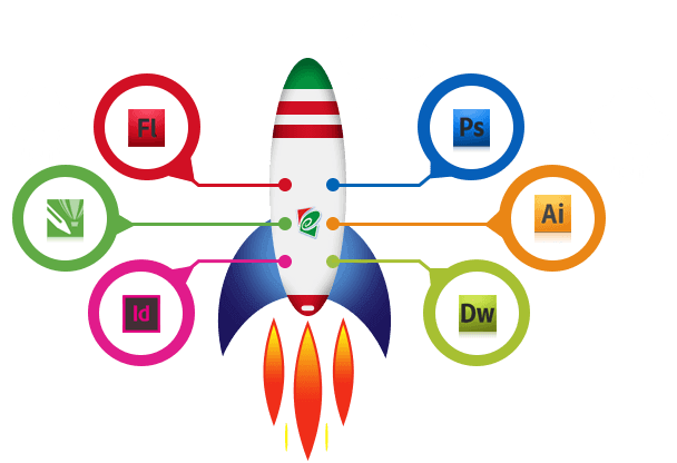
Every designer loves a slight unrestricted leash, but it is good to provide them with a jumping-off point. Solid groundwork tells that what they are wishing to make. One more designer told us that he doesn’t want inspiration visual but he wants skin in the game for making the faster brand board or has them approve which we made from their criteria. Also, we want to make a questionnaire that will help to guide both revelries easily. Discovering new colors from PSD wheel is one of the best efforts which will make the client happy.
Trust on logo designer
Your opinion will always decide that you want a logo or no and you know how to tackle with your audience best. But in the long term, you should listen to the designer and trust the expertise of them too. Always hire a person you trust and try not to underestimate them for no reason. This will increase the productivity.
Don’t think you are going to Nike swoosh story
We know the story of the most famous brand Nike but never try to think that you will get something like that at a smaller cost. Nike has paid $35 for the logo and you don’t get a logo like that in just $5.
Vector and raster difference
Always know that what the basic difference between vectors and raster images is. A raster is a file of the bitmap which is made of pixels and the raster files are of JPG and PNG. These images are of gradient and subtle edges.
Plenty background information
How your services are going to affect the audience is a must that you must tell your designer in detail. You can also tell that your brand is the new one or the older one. This will clear that what is in your mind.
Talk about working or not working and why
Explain why you cannot make these changes in the logo and why they are not working for your brand will clear the mind of the designer.
The logo will never look same everywhere
The client must know that colors are translating something and work accordingly. Every color cannot be good for every brand.
4 Reason why your writing counts a lot in the web design
The digital world is now facilitating our lives from individuals to businesses, all endeavor to shape their niche. Some newbies and the expert web designers are trying to make space in this race for last decades. A successful website is all about the visuals and we believe that this is true up to some extent. Web designing visuals and aesthetics are important but another factor that should be recognized is good writing. We know that arranging everything in a perfect row can make you the market leader in your niche.

Attention-grabbing
When you want to take the attention in the crowd you shout and scream this is your gesture of taking the attention. The same example is for content also on the website. So how you can take the attention online? Images are better than a thousand words but they are not much attention taking tool alone. You have to tell things precisely if you want to tell something to the audience on the website. You can engage a lot of audiences when you are telling effective things in the content and you can also put down your words in writing.

Demonstrate Credibility
Most of the website expectations are different but they all have common necessities. They all seem to be credible. It’s a logical necessity if you are using your website as a place to aid you to trade something or endorsing a source or pander people in doing precise actions. The basis of the website is achieving the trust of the audience. This is not difficult to make a website which looks serious. You just need to put the right visuals along with the content to make the things effective one. A cherry on top of the visual is always the content in text format. The best content will not only engage the larger audience but it will make the web link credible. You can also delicately attain this. It is pointless to write about the high quality of your products or variety about the high level of trustworthiness.
On the opposing, such type of things can have the differing consequence on the clients. When you speak for yourself that is best telling about the company repute.
Communication Enhancement
Many organizations are communicating between the trademarks they reflect. In fact, organizations, groups, and individuals get assessed by how they are talking to the audience. The good they communicate is telling that how good they are reaching their goals. Websites are the same thing because they can use as a platform for effective communication. You have to know the effective writing skills which will nurture your business on the internet.
Give height to visual impact
When a website only has images on it that is not much attention grabbing so far. If there is no content that will never explain the images. But thanks to the image with content which can easily connect the audience. Your clients won’t realize what the visual trying to say. They can also display a different response from the audience. A describing line of content with an image will tell the audience about you and they will surely react as per your expectation. Content addition can easily make your website a good quality design on the website. On the other hand, you can add animations with the content which will also give the impact of entertainment and engage more audience.
5 Common Mistakes Small Businesses Make with SEO
Some of the small businesses are dominated by local searches specifically. There are the problems most small businesses are facing when they are coming to the website copy. He shares the common SEO mistakes that you can avoid with just a bit of planning and awareness. We will tell you some of the common practices which can fail the SEO section of the website and most of the businesses are applying them and complaining that their website is not ranking in the top 10 positions.
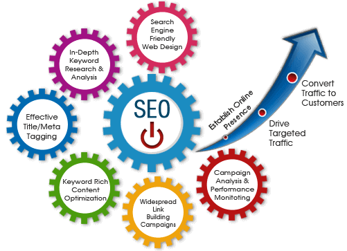
Waiting to launch the website for SEO consideration
Most of the business holder start observing the website right after the launch which is obviously not easy. On the other hand, the web design is not that much solid that it can be helpful in ranking so it needs to redesign once again. Some of the researchers say that most of the web developers never keep in mind all the factors of the website which decrease the performance of the search engines.

SEO is not the small business development channel
SEO never work like a media for advertisement of your business. It is not the game of money like PPC or any other type of media. Search engines have some certain rules on which you have to work if you want to rank. A good SEO strategy is to manage and become an expert in the SEO department. There is no guarantee of SEO so never make yourself a fool. Most of the expert make stronger strategies to enhance the rankings, traffic, and conversions. Google has 200 variables in the algorithm. SEO is 0ne of the long-term game not for the shorter period of time. Invest right way in the SEO to get better results over time.
Web developers should perform SEO
A good web developer is the one who knows the SEO basics but we never met with both web development and SEO expert. There is a lot of information that is required to track the variables which can be considered. Web developers and SEO experts are working in the same way. They are working on different parts of one field. We can compare it with different doctors of the heart such as surgeon and an ophthalmologist well both are doctors but work in different ways.
Too good to be true
SEO is critical to do well. It always needs the high level of expertise and experience so that you will understand and manage the critical function efficiently. Every year or after 6 months Google change the policies and it is really hard to perform if rules change. There is no shortcut in SEO and you have to go long way to rank on search engines. SEO is not a cheap work it takes a lot of expenses also most of the agencies are now hiring in-house experts for SEO. Some web developing companies give add-on service of SEO which is not that much good and you should consult some professionals in this regard.
Organic traffic
You have to know the details of your website before doing SEO efforts. You also have to know that how will you track your effort which is really necessary. Google Analytics is the tool which is free and has a great tool to start. You can use GA for making the events and goals around your conversion point. With SEO experts you must know that how you will grab the traffic.
Golden rules of Logo Design
Logo designing is really a tricky part and most of the designers even do not know that whether this logo will beat the market or no. When you think of the person who is important in life a face of that person come to mind instantly. Same is the case of the brand from where you often buy products. Also, we have in mind that what was the experience with the brand which is one of the important factors in the success. The market is really congested and a lot of companies are working in the market and selling the same product. This is the reason competition is really high in the market and you need a smart logo design which can differentiate you from other brands. Every age and every logo be careful while making a logo with this part of the designing.
Basic Layout
When are you going to design the logo you have to ask the right question from the client and those questions can be why you are here? What do you do? And how do you do? This will surely tell you the mind-set of the client. These are straightforward questions but they can be difficult to answer. Also, these questions lead to more questions about the business of the client. When the answers are gathered you can easily estimate that you have to go for which design idea and from where to start working. Some strongest possible design can be found at the end of this session.
Sketchpad
Sketching can easily relax you because you can rest your eyes from bright pixels which are now dominating our lives. Also, this is the best way to records all your ideas that are coming to mind. You can never lose that idea too which come to mind when you wake up in the night. On the other hand, sketchpad can help you sketch everything which you want to put in the logo. This is one of the smart methods to save the time. You can also share your sketches with clients to see their opinion. This will never make them distracted and they will be more focused and serious in the logo designing procedure.
Balanced work
Always go for an interesting idea without taking the tension of color palettes. Colors are easy to change as per the choice because that is an easy way to change things. But a bad design can never be rescued with good palettes so always keep this in mind. A good idea of the logo is always good even if you see it in grey scale. If you don’t agree with us just have a look at the logo of the apple company.
Keeping things appropriate
It goes really deeper when you say its logo design. Your bad idea can ruin a brand identity or maybe the whole company. Logo designers never meant for designing only. They are also for selling too. Keep in mind while making the design. Most challenging part of any project is the good selection and knowing about a brand deeply.
Avoid Pitfalls in the Logo Design
When you are making the logo you have in mind that this is the combination of pixels but this is really a wrong definition of logo designing. When you are making a logo Photoshop can be the playground and you become king of the game. It is totally in your own hand to make a masterpiece which takes the attention of the audience. If you have a right toolkit for making a logo design you can become the market leader with ease. All you need is a good idea about a logo design and a perfect tool to make that idea on screen.
Value creating asset
If you observe the logo of Nike you will get to know that a brand logo plays an important role in the success of the brand. This is swoosh which was only cost $35 at that time. A student made this logo and this was one of the less pathetic designs in all so the company accepted this. It is one of the brands which excites the customers a lot with the best services. Not many logos can have the ability to talk to the customer. Nike is one of the logos which is famous and that brand talks to the customers. Some designs are more than infusing pixels with colors.
Logos that suck here is why
One of the famous logos is of Starbucks mermaid the face is changing with every enhancement. This is one of the seductive charms which is telling the perfection of coffee. This is now kind of boring topic for most of the audience. This logo is representing the old adventurous story of the mermaid which sounds not interesting anymore to the customers. Starbucks made its repute with the best taste of the coffee which can leave your mouth-watering. The logo is made in the stores of the Starbucks and also on the cups which they give to the customer filled with maliciousness coffee. Logo of Starbucks is the leading way and most of the fans of the coffee are choosing this brand as their first choice.
What makes a Logo Great?
You have to keep in mind the creative but simple idea on which you are going to make a logo. A logo is telling all the details about the company this is one of the right thinking of the people. When you will make a logo design beautifully then you will be able to make a website design too. But first, you have to make a logo with emotional attachment otherwise it will never capture the tall order for your company. Coca-Cola is one of the best logos which is made perfectly. In 1886 which this logo was designed originally. When you purchase this cold drink you actually get to know what you are actually paying for. The basic shapes are also becoming famous in the market and with that, some of the brands are just using the typeface which is making the logo unique. Companies in Dubai are doing a lot of effort to make a design look good. It also increases the business in the targeted audience and let them see what your company actually look like. On the other hand, the logo is telling services of the company.
Efficient Logo Design benefits to a company
Smart companies make the strong decision of logo designing. 2018 is the year of modern design ideas which are growing fast in the market and attracting the companies. If you see the logos of some companies you will realize that this is one of the basic need for every company to have a smart logo design. We see thousands of logo around us in all day but few of them sticks to our mind. Companies take a lot of time to make the logo which can attract the customers.
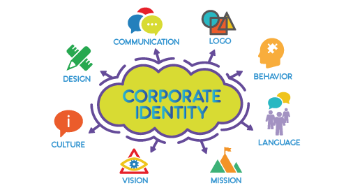
Setting brand identity
Brand identity is the key to success for a brand. The logo is always responsible for setting appropriate brand identity. If a company logo is not according to what company is giving services your business can never become successful in the market of Dubai. Every company is coming up with the unique logo design which can easily make a difference from other companies irrespective of what type of services they are offering. If you have a good logo design you are the one who has the strong brand identity.
Visibility of brand
Visibility is the baseline for every business and everyone want it as a company to get more audience. If you don’t have a logo your audience will never get to know about your services. It is not about you but about your company, this is the reason a logo is a must for a company. It has to be on the banner and on the office stationary too so that it can spread the name of your brand. Visibility of the brand is a must if you want to get the success in your target market.
Social media and logo design
You can use your logo in the social media marketing campaigns. This is the best way to become famous efficiently. Social media ads are usually paid one and you can do it for the targeted audience. People get to know about the services instantly and some of them become your loyal customers too. But logo has to be very powerful with a positive message otherwise you can also lose the loyal customers. Social media campaigns are the powerful tool which can be used as a weapon in the war with your competitors. You can also take advantage of it.
Take the idea from competitors
Most of the brand’s research on the logo and always go for what competitors are doing with the logo to get famous in the market. This is not the bad idea but never try to copy the idea of competitors if you want to stay unique in the market. Your designer has to come with artistic ideas instead of copying competitors stuff. If you look same as your competitor audience can think that your company and that company is together or you are working with them which is bad for your business.
Illustration of logo
Your logo should not be a raster image because those images are not printable when resize. Go for a vector image or illustration which can be flexible to print on anything such as banners, stationery, visiting card, and on other stuff. Designers now make different versions of the logo to ease the company. They can use each version for the different purpose. You can also ask for the original file of the logo and that is in an extension.
Famous Logos Process Sketches
You will get wondered today that how these famous brands made their process sketches. Some of them were very rough sketches but were accepted by the brands and they started working on it. Refined ideas come from a lot of effort and sometimes it just needs an artistic mind to make a logo instead of planning a lot.
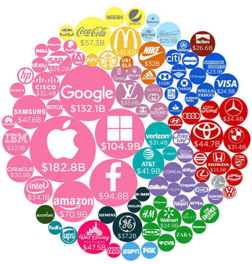
Citibank
Paula Scher draws the processing sketch of the brand. It was on a napkin in the first meeting with the company. This was the integration of an old style of the umbrella on the timeless word mark. The design was loved and approved by the brand and they accepted it at the end of the meeting.
Nike
In 1971 Nike logo was created by the state of Portland University of graphic designers. Name of the student was Carolyn Davidson for only $35. She made 6 logo designs for the company and the company picks one of them which was less awful. The logo made a name in the market and got the fame due to the simplicity but it never updated since it was created. Now the company has a big business and share in the market but the logo is still really simple.
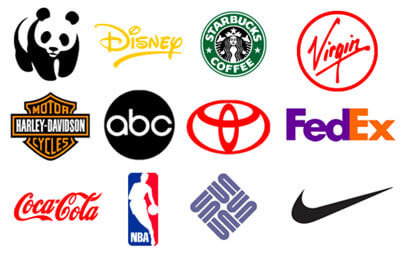
Pinterest updated their logo in the year 2011 to give it a sophisticated look. They use Bello script for making the typeface and enhanced it. Use of Ligatures make it more beautiful and the audience is loving to have this. The logo is good and people are satisfied with the changes designer made in the logo. After that time till now no change has come in this logo design till now.
Shell
In 1971 Raymond Loewy makes over the logo of the shell and this shape is still working for the brand. Before this time the shell was never satisfied with the logo and it was changing all the time because it easily becomes outdated. Now shell is not furthermore enhancing the logo as Raymond has done a lot of work in this and the logo seems modern now. He used some powerful tools to process sketch the logo before originally making it.
Exxon Mobile
Process sketch of the Exxon mobile is made by Raymond Loewy which is perfect and having the concept of double x’s. He made it in 18 variations but he chooses one from these 18 and marks okay with it. This is one of the tough logo process sketches which he faced. Company loves the logo and with minimum changes, the logo is still working on the brand.
I Love New York
Milton Glaser made the process sketch of the brand. This is one of the iconic logo design which was printed on envelops in the campaign. He never charged any price for the beautiful logo. This is one of the strange things because the logo got a lot of fame in the world.
Starbucks
The two-tailed mermaid was the inspiration of Starbucks which was the Norse of 15th Century. This logo was designed by the professional named Terry Heckler. With the passage of time lady mermaid was enhanced and we can see how the modern lady mermaid on envelopes and on the mugs of Starbucks. The brand is famous in the market and the logo is very catchy as per need.
MailChimp
Jon Hicks updated the logo of MailChimp who is also the designer of the logo of Firefox in the year 2008. He refined some rough sketches to make a perfect logo.
Most expensive logo designs
Branding is one of the famous terms when you are the maker of the company. One thing is also famous in the market and that is the logo. A company logo is the identity of its brands and telling all about a company easily. Logo designing is becoming an industry with the passage of time. Companies are paying a lot to make a logo which is more memorable for the audience.
Belfast Logo Design
They decided to change the logo in the year 2008. The strategy of the logo cost them $280,000 for the new logo design. This is a heart shape in which Belfast is written. This logo is sending the message of love to the audience which is something very positive. The violent history of the Belfast is now over. City council is telling that B is used for different things here such as be welcome, be part of it, and be vibrant. This is most expensive logo design with something really positive.
City of the Melbourne
In 2009 this logo was planned for the new corporate industry of Melbourne. This is one of the finest logo design and has a lot of worth in the industry. Some of the logos are providing value to the money and this is one of them. Logo designer was one of the London based brand Consultancy Company named Wolff Olins in the year 2007. The design was very criticized for being unprofessional. Cost of the logo is around $625,000. The fame of this logo was too much but not in positive manners.
Pepsi Cola
Now we are discussing the re-designing of the logo and in that Pepsi has also enhanced the logo. PepsiCo is one of the biggest drink brands in all over the world. In 2008 the logo was re-design and the cost of it was $1000, 000 according to the reports. This logo was not loved by the critics and they call it biggest failure. On the other hand, they are saying that Pepsi has failed in the logo as compare to coca cola.
BBC
In 1997 the logo of BBC has redesigned the branding cost of this logo is around $1,800,000. Brand awareness is vital for BBC and the money was well spent. This design is universally recognized. The logo is with the longest life on the screen which was in the year 1971-1988. In 2016 the things were more enhanced.
ANZ
The rebranding of this company was made in the year 2010 to 2012. This is one of the famous Australian and New Zealand banking group. The cost of this logo is around $15 million. Also, this includes all the marketing strategy. This is one of the popular banks in Australia so the adequate branding is difficult. Spending the big amount of logo re-designing and branding is justifiable.
British Petroleum (BP)
British Petroleum is one of the famous brand known as BP. In the year 2000, the logo was designed with the strong strategy. This logo was using 70 years with the current “Helios”. This was cost $211,000,000. Green and yellow are the major colors in the brand logo which are looking amazing. BP strategies are incorporated in these banks.

